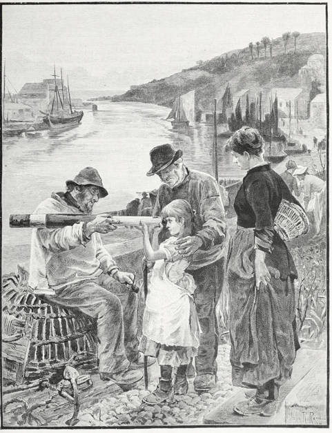
The Rival Grandfathers
J. R. Reid.
Oil on canvas
Exhibited at the Grosvenor Gallery in 1884
Source: Magazine of Art, which comments that “Mr. Reid's The Rival Grandfathers, a fresh and vigorous study of values in landscape and character in humanity, will find admirers innumerable. . . . Mr. J. R. Reid has put forth his full strength, as colourist and composer, in his two contributions to the Academy and the Grosvenor, the second of which, The Rival Grandfathers, is here engraved.” [continued below]
[You may use this image without prior permission for any scholarly or educational purpose as long as you (1) credit the University of Toronto and the Internet Archive and (2) link your document to this URL in a web document or cite the Victorian Web in a print one. — George P. Landow]
The Academy picture, An Ugly Customer, is very similar to this in colour, in subject, in scope; but in some other respects it suggests a comparison which is full of interest as very effectively illustrating the artist's method and the dangers that especially beset colourists Both these works are excellent pictures and not merely studies of figures set in a framework of landscape; the figures are inseparably associated with the atmosphere and tone of their surroundings. Both are powerfully wrought, skilfully composed, luminous in lighting and atmosphere, strong in colour; in both the hgures are full of force and admirably characterised, yet with all these according excellences The Rival Grandfathers is superior in technique and in harmony to its companion. Mr. Reid's sense of colour is something intuitive, something so native, so intense, that it overwhelms sometimes the other artistic faculties, or at least dominates and benumbs them. There is some truth in the saying that the highly-developed sense of colour affords also mastery over form; but it as often involves slovenly execution, ill-distributed force, and defective harmony. The inequalities of much of Mr. Reid's early work are palpable: crudity displacing strength of colour, seas and skies without corelation, powerful distance and foreground with a debatable land midway, we have seen more than once. In An Ugly Customer an old fisherman is exhibiting a huge lobster to two children, the elder of whom is tickling the monster's protruding eye with a straw, while the fair-haired younger child looks on half afraid with arms stiffened and fingers drawn back with disgust. Excellent in humour and character are the three figures, beyond whom stretches the deep haven and the shipping, to the round green hill that guards the entrance to the port, with its cluster of trees, its grey cottages, and the long many-arched bridge spanning the estuary. The distance is admirable, the sense of space and sea-air is finely suggested; the water, however, is spotty in effect and woolly in texture, while on the left a quay is represented with the substantial figures of a woman and a lounging fisherman. The distant bridge has all the solidity and colour that the near quay is absolutely deficient in; the latter is vaporous and devoid of texture, the blurred indication of a massive stone post and the two powerful figures adjacent are mutually antagonistic, and the result is a curious mingling of force and ineptitude. There arc no such teechnical disparities in The Rival Grandfathers, no sacrifice of things essential, though secondary, to the emphatic presentment of the figures. The scene is one of those deep land-locked havens frequent in South Devon and Cornwall. From a garden delightfully suggestive of the situation, the happy possessor of two grandfathers is looking through an old brass telescope which is supported on the arm of one rival, while the other, a kindly, ruddy-faced old salt, is caressing his grand- child. The mother looks on with pleasant approbation, and the child's expression is full of interest. The old fellow seated on the creel, tobacco-pipe in hand, is a rare character, ready with a yarn, full of quips and humours, and strange of speech; he and his companion, whose huge brown hand nearly covers the child's back, are the most successful of Mr. Reid's fishermen, redolent of sea-air and odours, admirable for nature and humanity. The water is more liquescent than in An Ugly Customer, while the distance, the steep hillside, the various craft alongside the quay, are treated with equal power and truth. The whole work, in colour and composition, is finely harmonised; it is also equal in concentration and force to anything Mr. Reid had produced, and superior in accomplishment, in unity, and ensemble.” — Magazine of Art, 444-46
Bibliography
“Current Art —IV.” The Chronicle of Art. 7 (1883-84): 442-48. Internet Archive version of a copy in the University of Toronto Library. Web. 31 December 2014.
Victorian
Web
Visual
Arts
Painting
Artists
Created 2 January 2015