[Click on images to enlarge them.]

Richard Saul Wurman’s Access Guide explains that “Jacopo Sansovino designed this building, but it was completed by his pupil Vincenzo Scamozzi. The façade was designed as a continuation of the Procuratie Nuove on the Piazzetta, so as to emphasize the architectural unity of the whole compound. The Roman-inspired solemnity of the exterior was intended to represent visually the power and wealth of the Venetian Republic. The building was destined to contain the burgeoning Biblioteca Marciana, or Library of St. Mark’s, a collection of precious manuscripts and early printed books (incunabula). It was built by the Republic around an initial donation by poet Francesco Petrarca and by the great humanist Cardinal Bessarion” (161).


In the tourist guide to the city’s architecture that appears near the end of the third volume of The Stones of Venice, Ruskin both defends and criticizes the Biblioteca Marciana. He first praises it as “a graceful building of the central Renaissance, designed by Sansovino, 1536, and much admired by all architects of the school. It was continued by Scamozzi, down the whole side of St. Mark’s Place, adding another story above it, which modern critics blame as destroying the ‘eurithmia;’ never considering that had the two low stories of the Library been continued along the entire length of the Piazza, they would have looked so low that the entire dignity of the square would have been lost. As it is, the Library is left in its originally good proportions, and the larger mass of the Procuratie Nuove forms a more majestic, though less graceful, side for the great square” (11.389).
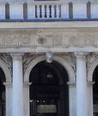
He immediately follows his defense of the building by pointing to the problematic nature of what he terms “the design of the parts.” In particular, he criticizes the Renaissance architects for what is both artistic dishonesty and a lack of architectural functionalism: “It is one of the grossest examples of the base Renaissance habit of turning keystones into brackets, throwing them out in bold projection (not less than a foot and a half) beyond the mouldings of the arch; a practice utterly barbarous, inasmuch as it evidently tends to dislocate the entire arch, if any real weight were laid on the extremity of the keystone.” In other words, the architect has emphasized key structural details as a way of embellishing the library but in fact does so in a way that suggests the building is unstable. Ruskin then continues “it is also a very characteristic example of the vulgar and painful mode of filling spandrils by naked figures in alto-relievo, leaning against the arch on each side, and appearing they were continually in danger of slipping off.” Nonetheless, despite these criticisms, he admits, “Many of these figures have, however, some merit in themselves; and the whole building is graceful and effective of its kind” (11.389-90).
More of Ruskin's Venice
- St Mark’s Cathedral
- The Palazzo Ducale, Venice
- The Scuola de San Rocco
- Palazzi
- On the Grand Canal
- Leaving the Grand Canal
- On the way to Venice from the mainland
- Venice: Details and Corners
Photographs 2020. [You may use these images without prior permission for any scholarly or educational purpose as long as you (1) credit the photographer and (2) link your document to this URL in a web document or cite the Victorian Web in a print one.]
Bibliography
Ruskin, John. The Works. Ed. E. T. Cook and Alexander Wedderburn. “The Library Edition.” 39 vols. London: George Allen, 1903-1912.
Wurman, Richard Saul [and Patricia Schultz]. Florence Venice Milan Access. New York: HarperCollins, n.d.
� �
Last Modified 27 March 2020