These photographs were taken by the author at a free exhibition of work from the De Morgan Foundation's collection, which opened on 11 May 2018 and runs until 28 October 2018 at the Guildhall Art Gallery, off Gresham Street in the City of London. For more details, see offsite here. The photographs accompany our review of the exhibition. Thank you to both the De Morgan Foundation and the Guildhall Art Gallery for permitting photography. Click on the images to enlarge them.


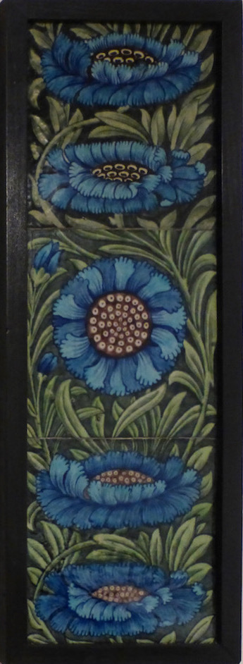
Left two: Honeysuckle tile panel, 1872-1907, with close-up of an individual tile. Right two: Floral pattern tile panel, also dated 1872-1907, with close-up of part of the panel.
The honeysuckle-patterned tile panel looks like something from William Morris, and indeed the gallery label suggests that William De Morgan, perhaps designing for a fire-surround, may have been intended these tiles to complement a Morris interior. They look very attractive even on their own. The more typically De Morgan floral patterned tiles, with their exotic flavour and richer colours, might also have been intended for a surround: as the label points out here, "inverted teardrop shapes on the outside edge of each individual tile" make it very suitable for repeating horizontally.

Left to right: (a) Two-handled vase. (b) Ruby and gold lustre jardiniére. (c) Hare and bear plate in colours matching the floral pattern around the wide rim. (d) Another ruby and gold lustre jardiniére. (e) Bull vase.
The jardiniéres are picked out in the exhibition catalogue as examples of De Morgan's use of interlocking ruby and gold lustre triangles at the bases and rims, setting off the exotic designs on the curved middle parts. Of the vases, the "bull" one is them most notable, "so unusual in shape that it was probably made to De Morgan's specification" (Hardy 27). As usual, the design is enjoyably quirky, since the wide part at the top is dominated by a pair of bulls looking belligerently to the front, their tails curling towards the handles at each side (unfortunately, this is hard to see here).


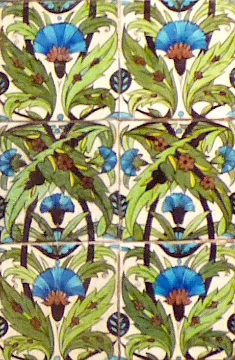
Left to right: (a) Double Carnation Tile Panel (1872-1907). (b) Another floral tile pattern. (c) Islam Arches Tile (1872-1907).
When Sarah Hardy explains in the catalogue that "[r]otational symmetry — where a pattern is repeated around a central point — is ... a key mathematical principle of De Morgan's tile design," she uses the "Double Carnation" ones as her example, inviting us to see how "the flattened pattern retains elements of the movement of growing flowers as the eye follows the rotation" (24). In the adjacent floral tile panel, the effect of upward movement is achieved by the stems of the bell-flowers, which overlap the edges of the individual tiles. Depth is cleverly suggested in the scene through the arches of the tile-picture on the right — first there is another arch, seen either side of the central column, and beyond that is a courtyard. Notice that the column on the right is not shown. Perhaps a longer panel, for a wide frieze, was intended. According to the gallery label, the design for each individual tile would have been transferred from tracing paper before the tiles were put together. It is a remarkable work.


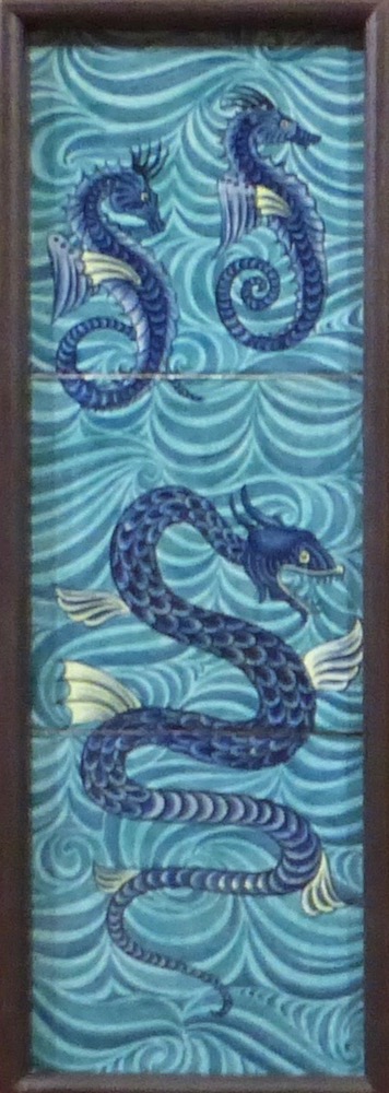
Left to right: (a) Carnation and Leaf tile pattern, tin glazed (1872-1907) with scope for both vertical and and horizontal extension. (b) Marlborough Tile Pattern (1888-1907). (c) Arabia Tile, tin glazed (1888-97). (d) Seahorse Tile Panel.
The Marlborough Tile at (b) is of special interest here. It was designed as part of De Morgan's commission to provide tile designs for twelve P&O liners during his Fulham period, and is more figurative and seems to have more depth than his usual work. As the gallery label puts it: "The circle shape of the middle flower has been stretched into an oval-shaped ellipse in the other flowers in this panel," making it look as if we are seeing them from the side. The Arabia pattern was also for P&O, for S.S. Arabia, and the exhibition shows a photograph of tiles in this pattern as a lower border to a wider band of tiles depicting trees. Notable in the sea-horse panel are the wonderfully lively, sinuous and scaly "tails."
Related Material
Bibliography
Hardy, Sarah. Sublime Symmetry: The Mathematics behind De Morgan's Designs. Compton, Guildford, Surrey: The De Morgan Foundation, 2016. 36 pp. Available at the exhibition. £3.50. (For further information about the Foundation, please visit their website).
Created 28 May 2018