erbert Granville Fell (1872–1951) was a painter, illustrator, designer, editor, teacher and art-critic. Though born in the Victorian period, he lived well into the twentieth century, expressing his versatility in a wide variety of roles. He was the Director of Drawing, Painting and Design at the Royal Albert Memorial College in Exeter, exhibited commercially, wrote several books on painters – notably Cezanne – and worked as the art-editor and editor for The Ladies’ Field (1907–19), The Strand Magazine (1910–12) and The Queen (1924–8). Fell is perhaps best known, however, for his long service as the editor of The Connoisseur (1935–51), which was, and remains, an influential periodical.
Yet Fell’s reputation as an artist has declined; as Simon Houfe observes, he ‘deserves more recognition’ (133) among modern critics than he is currently accorded. In the 1890s he was regarded as a leading designer of book-art. His illustrations were regularly reviewed in The Studio, the primary art-magazine of the time, and he enjoyed special praise for his epic treatments of The Book of Job (1896), The Song of Solomon (1897), and for his books for children, especially those in the ‘Banbury Cross’ series of the mid-90s. He was also at the forefront of developments in cover design. In addition to producing trade bindings for a wide audience, he was the main designer of luxurious editions using the ‘vellucent’ technique invented by the binder Cedric Chivers.
In short, Fell was an important contributor to the book culture of the Nineties. Never less than inventive and imaginative, his creations deserve to be reassessed. At the time of writing (2022) there are no detailed analyses of his oeuvre, and he has never been the subject of a monograph.
Fell and the Unified Book: Illustrations
Fell made a significant contribution to the idea of the all-round book artist, and like Aubrey Beardsley and Charles Ricketts was the author of his books’ visual material and their bindings. One of the creators of what John Russell Taylor calls the ‘book beautiful’ of the Nineties, he designed his works as unified visual schemes in which each part is integrated to create an organic, multi-dimensional text. In contrast to the elaborate illustrated books of the Sixties, which often had only a minimal connection between the outside and inside, he presents his volumes as versions of gesamtkunstwerk.
His illustrations are a complex fusion of styles in which he mediates between Art Nouveau and Arts and Crafts while reaffirming the tropes of second-stage Pre-Raphaelitism, which he exploits as a source of symbolism. Fell often achieves this synthesis in single designs, which act as an epitome of the competing manners of the 1890s, especially in the illustrations for The Song of Solomon (1897). In As the lily among thorns, for instance, he treats parts of the composition in differing ways: he invests the central figure with the monumentality of Pre-Raphaelite illustration, creating a link with the female type defined by Edward Burne-Jones; he crowds the floral displays into limited space in the style of Arts and Crafts; and he extends and simplifies the verticals in echo of the Art Nouveau line as it appears in work by Beardsley and Talwin Morris.


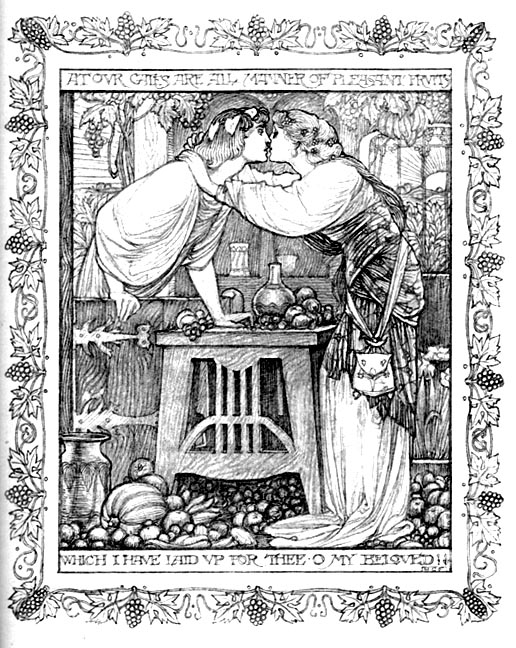
Two of Fell’s designs for The Song of Solomon. Left: At our gates are all manner of pleasant fruits; and right: As the lily among thorns.
The effect is effortlessly synthetic, combining the various styles into a tensionless whole in which ‘knowledge of the figure’ (Wood 27), a strength developed during the artist’s training at Heatherley’s School of Art, is seamlessly combined with the period’s decorative aesthetics. At the time of publication, Fell’s illustrations were praised for their harmonies and it was commonplace to speak of him as a lyrical artist who combined the deep feeling vested in his figure-drawing with pleasing accessories and pattern-making. In the words of Esther Wood, he was ‘one of the most sincere and graceful’ of late Victorian designers who united ‘intensity of idea’ with ‘dignity’ and ‘decorative skill’ (26).
That sweetness is exemplified by At our gates, also from The Song of Solomon, and by the pictorial title-page for W. B. Yeats’s Poems (1895). Both images are tender scenes in which the artist seems to review the essential features of Pre-Raphaelitism: At our gates is a version of D. G. Rossetti’s embracing couples and the second an elaborate quotation of familiar medieval types, with the knight in armour invoking Burne-Jones’s Arthurian figures; the angels are likewise quotations from the Pre-Raphaelite lexicon, and echo the divine beings in Rossetti’s neo-medieval watercolours and book illustrations of the 50s.
These images exemplify the Pre-Raphaelite idyll, asserting its currency at the very end of the nineteenth century. But this is only one part of Fell’s iconography. Though as dreamily introspective as his mentors, a quality which was sometimes regarded by contemporaries as the mark of a ‘restrained imagination’ and lack of originality, he was equally capable of rendering high drama and disturbing emotion in a ‘robust’ and imposing form (Sketchley 27–8).

An ex-libris design by Fell, deploying Symbolist imagery.
Fell’s facility in figure drawing is applied to unsettling effect in a bookplate he designed for his own consumption. Bookplates are often memento mori, and Fell invests his image with an unsettling symbolism. Visualizing himself as a bound neo-classical slave, he shows the Angel of Death peering directly into his face while pointing at an hour-glass; the reclining figure looks pitifully upwards, exposing his throat in a gesture of pain and vulnerability, and the Angel bears down heavily, as if preying on the time-bound victim. The artist accentuates the contrast of gestures by placing them in the claustrophobic space, investing the whole with the unblinking focus of a nightmare.
Sketchley remarks that Fell’s work has ‘no trace of morbid … thought’ (27), but the reverse is true: though a master of lyrical stasis and reverie, many of his illustrations are weighted with negative or troubled emotion. These moments are sometimes episodes of heavy stillness, as in Job prayeth for this friends, and Job appealeth from men to God, but Fell is equally adept at depicting scenes of high drama in dynamic movement. In The Song of Solomon he employs many such designs, in each case expressing the characters’ deep feeling in the restless line of Art Nouveau, thus figuring inner agitation in the outward movement of whiplash arabesques and convulsive figures. Once again, he fuses the decorative and the expressive into one, notably in his dynamic frontispiece of the Leviathan in The Book of Job. Imagined in fantastical terms, the creature is at once a dramatic character and a piece of extravagant pattern-making made up of sinuous lines and contrasts of absolute black and white.


Two more of Fell’s designs. Left: Title-page for Yeats’s verse; and right: Job prayeth for his friends.
We can see, in short, that Fell is an effective illustrator of psychological conditions, from love and romance to anguish and despair, as well as an artist of ornamental effects. He also did a series of light-hearted, romantic designs for children’s books, all of which have the dreamy intensity of his work for adults. A final dimension is his purely decorative design for title-pages, borders and head and tail-pieces. These, typically, vary between styles: some look like they were designed by William Morris and others by Beardsley. Generally speaking, though, Fell’s decorative pieces in are the manner of Art Nouveau, recreating Beardsley’s sinuous interlaces of white against a black background. Fell also emulates Beardsley’s slightly sinister tone – a borrowing that can be seen on the title-page of The Book of Job (1896).
Taken as a whole, Granville Fell was an eclectic contributor to book illustration of the end of the nineteenth century. He continued to work well in the twentieth century, although most of his effects were re-focused on his writing and his output in art diminished. He did produce some illustrative series, notably A Wonder Book for Boys and Girls (1903), for which he designed some highly imaginative images in colour. These designs form a continuum with his earlier work, but Fell’s later career was largely spent as a writer on art.
Bibliography
Primary: Illustrated books by Fell in the Victorian Period (note that the bindings are also by Fell)
The Art Bible. London: Newnes, 1901.
The Book of Job. London: Dent, 1896.
Fairy Gifts: and Tom Hickathrift. London: Dent, 1895 (Banbury Cross Series).
[Herodotus]. Wonder Stories from Herodotus. New York: Harper, 1900.
The History of Ali Baba. London: Dent, 1895 (Banbury Cross Series).
The History of Cinderella. London: Dent, 1895 (Banbury Cross Series).
Maud, Constance. Wagner’s Heroes. London: Edward Arnold, 1900
Nesbit, E. The Book of Dragons. New York: Harper, 1901.
The Song of Solomon. London: Chapman & Hall, 1897.
Wicksteed, P. H. Our Lady's Tumbler. London: Dent, 1896.
A Wonder Book. London: Dent, 1903.
Yeats, W. B. Poems. London: T. Fisher Unwin, 1895.
Primary: Writings by Fell
The Connoisseur, 1935–51.
Fell, Herbert Granville. Cezanne. London: Nelson [1934].
The Ladies’ Field, 1907–19.
The Queen, 1924–8.
The Strand Magazine, 1910–12.
Secondary
Houfe, Simon. The Dictionary of 19th Century British Book illustrators. Rev. Ed. Woodbridge: Suffolk: The Antique Collectors Club, 1998.
Sketchley, R. E. D. English Book Illustration of Today. London: Kegan Paul, 1903.
The Studio, 1893 –1901.
Taylor, John Russell. The Art Nouveau Book in England. 1966; rpt. Edinburgh: Harris, 1980.
Wood, Esther. ‘British Trade Book Bindings and their Designers.’ The Winter Number of The Studio (1899–1900): 3–37.
Created 29 January 2022