n 1859 by Bradbury and Evans began Once a Week as a rival to Dickens’s All the Year Round, presenting itself as an illustrated magazine to compete with the blind columns of its competitor. The publishers wanted its pages to be as vivid and imposing as possible, and to achieve this effect they employed the literary journalist and art-critic Samuel Lucas (1818–68). Now generally recognised as one of the most important figures in the world of Victorian illustration, Lucas was knowledgeable of contemporary black and white and treated his brief seriously; with only a few months to prepare for the first issue on 2 July 1859 he recruited a cast of outstanding talent that was partly drawn from Punch, which was also published by Bradbury and Evans and formed a ready-made resource, and from his contacts in the art-world. Frederick Sandys and J. E. Millais were among the in-comers, but Keene was already employed at Punch and made a straightforward transition to Once a Week. Lucas made most of his deals informally, and it is likely that he procured Keene’s services at conversations at the famous Punch Table, where contributors met for dinner and drinks while they idly carved their initials in its surface (Layard, p. 75).
Lucas’s securing of Keene’s services was nevertheless an interesting move, given that at this stage in the artist’s career it was not entirely clear as to what role he would occupy at the new magazine. The obvious choice would be to assign him comic subjects in the manner of his Punch designs (which he continued to produce during his time at Once a Week); however, Lucas also had the services of John Leech and Hablot Browne (Phiz), and although Keene produced some humorous work for Once a Week it is notable that Lucas primarily recruited him as an illustrator of serious fiction.
With no evidence of his suitability to this task and with no previous experience of visualizing fiction beyond a few minor pieces, Lucas engaged him, nevertheless, as the illustrator of Reade’s A Good Fight. He must have recognised Keene’s abilities, for this was an important job for an inexperienced interpreter of extended narratives; Lucas might also have been impressed by Keene’s versatility and self-confidence. According to Joseph Pennell, Keene insisted ‘a man who draws anything could draw everything’ (qtd. Cooke, Illustrated Periodicals, p.112), and this positive approach, designed to influence both Lucas and Bradbury and Evans, must have been seen as an asset in setting up a new periodical. Whatever the original thinking, Keene was set to work on Reade's historical romance, which is the first novel to appear in the opening number.
The artist’s immediate task, and one in which Lucas would have instructed him, was to impress (and retain) the new audience as it turned the magazine’s pages for the first time. As noted earlier, Once a Week intended to combine quality literature with illustrations in order to give it an advantage over All the Year Round, and Keene’s earliest designs (on 2 and 9 July, 1859) clearly set out to be as impressive and intriguing as possible.
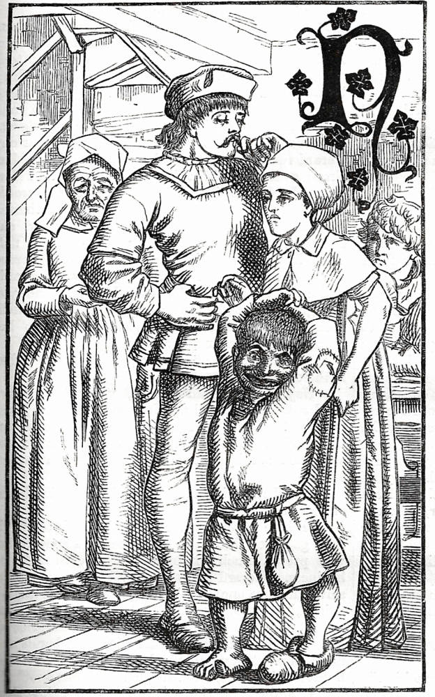
This purpose is achieved by their placement and juxtaposition with other visual material. The images are boldly promoted, for maximum effect, in the opening issue. Keene’s first design is positioned on page 11 of 34, a third of the way through and carefully positioned to capture or re-capture the reader/viewer’s attention at the very moment when it might flag. Visual impact is also heightened by placing it next to quieter, less ostentatious images. These are a blend of the commonplace and the introspective: three comic pieces by John Leech (1, pp. 1–2); a picture of a flint-head (p.4); two fanciful pieces of neo-medievalism by John Tenniel for ‘Audun and his White Bear’ (pp.4–5); and a nocturne by Millais for ‘Magenta’ (p.10). All are small scale, intricate and executed in a dense line. When we come to Keene’s opening image, however, the eye is arrested by the scale and positioning (occupying more than a third of the page); its orientation (vertical, extending over the left-hand column); and its bold and simple style. Figured in near-outline, it offers a version of the Germanic idiom and stands, especially, in stark opposition to the dark hatching of Millais’s facing illustration.
Keene further maximises the impact by showing a dense group representing the primary characters (Gerard, Catherine, Giles and mother), with Giles the dwarf looking directly at the viewer. Sharply-defined, dramatic and visually intriguing, this illustration works hard to engage the reader/viewer, and is especially important as a means to draw the interpreter into a story which unpromisingly starts with a piece of commonplace observation: ‘Not a day passes over the earth but men and women of no note do great deeds …' (1, p.11). Reade’s novel opens weakly, but Keene’s image, with its sharp visualization of the characters, poses the sort of questions that would encourage the reader to read on. This strategy is carried forward throughout the run of Reade’s serial, and is similarly important in promoting Meredith’s Evan Harrington and Wood’s Verner’s Pride. In the treatment of all three of these fictions Keene’s designs are given special prominence and form an equivalent, in the pages of Once a Week, of Punch’s eye-catching ‘big cut’.


Left: (a) Catherine and Gerard from A Good Fight. Right: Rumors of Rachel's death. [Click on these images for larger pictures.]
Lucas employed Keene, in short, as an artist who could win audiences through the provision of strong and imposing images which stimulated the eye and promoted the writing. More complicated is the question of why Lucas entrusted his artist with the illustration of three very different types of novel: one set in medieval times, one a Sensational text of the present, and the third a fiction of contemporary manners. As noted earlier, Lucas would have had little on which to judge Keene’s abilities as a reader; however, his approach can probably be explained by linking it to his views of illustrators and the role of illustration.
Lucas matched his illustrators to the text they had to visualise, and yet disliked the notion of the artist as a creative practitioner whose picturing of a text was interpretive. As far as he was concerned, the writer was the more important partner, and the illustrator a semi-technician who had to ‘translate’ the words into images. He may therefore have engaged Keene as just another able artist who had little to do but read the text and show it in the form of a visual paratext. At the same time, and somewhat paradoxically, he discouraged any form of communication between the two collaborators. With Keene, as with all of his artists, he expected the illustrator to visualise the text with no external prompts – re-inscribing what was described or explained in the writing and with no authorial instructions and no fanciful interpretations.
Keene was left with nothing but the texts, and on no occasion entered into the sort of working partnership that characterised the relationship of Dickens and Phiz or Eliot and Leighton. Whatever he represented, he represented without authorial interference of any sort, and never met with Reade, Meredith or Wood. In this he concurred with his editor’s instructions; however, left to his own devices he produced three interesting series which do more than mirror their texts, and are best viewed as both faithful and inventive. The following sections explore Keene’s responses within the context of the constraints that were imposed on him.
Works cited and sources of information
Adams, Charles Warren]. ‘‘The Notting Hill Mystery.’ Once a Week (November 1862–January 1863). London: Bradbury & Evans, 1862–3.
Buckler, William E. ‘Once a Week under Samuel Lucas, 1859–65.’ PMLA 67 (1952): 924–41.
Cooke, Simon. Illustrated Periodicals of the 1860s: Contexts and Collaborations. Pinner: PLA; London: The British Library; Newcastle, Delaware: Oak Knoll Press, 2010.
Brothers Dalziel, The. A Record of Work, 1840–1890. 1901; new ed. London: Batsford, 1978.
Goldman, Paul. Victorian Illustration: the Pre-Raphaelites, the Idyllic School and the High Victorians. Aldershot: Scolar, 1996; new ed. London: Lund Humphries, 2004.
Houfe, Simon. The Work of Charles Samuel Keene. Aldershot: Scolar, 1995.
Layard, G. S. The Life and Letters of Charles Samuel Keene. London: Sampson Low, Marston & Co., 1892.
[Lucas, Samuel]. ‘Illustrated Books.’ The Times. 24 January 1858: 10.
[Lucas, Samuel]. ‘More Gift Books.’ The Times. 2 January 1865: 12.
Muir, Percy. Victorian Illustration. London: Batsford, 1971.
Pantazzi, Sybille. ‘Author and Illustrator: Images in Confrontation’. Victorian Periodicals Newsletter 9:2 (June 1976): 39–49.
Pennell, Joseph. Pen Drawing and Pen Draughtsmen. London: Macmillan, 1897.
Ray, Gordon. The Illustrator and the Book in England from 1790 to 1914. New York: Pierpont Morgan Library, 1976.
Reid, Forrest. Illustrators of the Eighteen Sixties. 1928; rpt. New York: Dover, 1975.
White, Gleeson. English Illustration: The Sixties, 1855 –70. London: Constable, 1897.
Last modified 7 May 2014