Introduction: bindings by comic artists
ictorian trade bindings of the 1860s were dominated by the complex, ornamental designs of John Leighton, John Sliegh, Harry Rogers, Robert Dudley and Albert Henry Warren. Characterized by a combination of pictorial inventiveness and technical excellence, casings of the mid-century represent a new development in both the standing of mass publications and the status of the designers, and it was not uncommon for their names to be used as a selling point which competed on practically the same terms as the name of a painter or illustrator. Indeed, the twin occupations of designer and artist were frequently merged, and it is noticeable that all of the outstanding figures of the period were active in multiple fields as fine and applied artists. These overlaps were commonplace in the crowded art-market of the time, and in the case of illustrated books it was not unusual for the creator of the binding to embellish the pages. Robert Dudley’s The Atlantic Telegraph [1866], with its elaborate livery and vivid chromolightographs, is a good example; Albert Warren and Harry Rogers were similarly employed within and without, and all were in this sense ‘book artists’ rather than cover designers with a limited brief.
This arrangement made economic sense and any assessment of the sixties must register the designers’ versatility, a theme taken up by Ruari Maclean in his monumental Victorian Book Design (1963). Less well-known is the fact that several of the most accomplished illustrators of the period – rather than designers who worked as illustrators – were also employed as designers of cloth casings, normally for the books that contained their images. A significant cohort is formed by the comic artists of the period from the mid-thirties to the mid-seventies, although this aspect of Victorian publication has never been studied as a significant subject in its own right.
George and Isaac [Robert] Cruikshank designed bindings for their own illustrated books, and so did Charles and Richard Doyle, John Leech, Charles Bennett, Ernest Griset and Hablot Knight Browne (Phiz). Victorian book-design of the middle part of the century is sometimes described as lacking in focus and cohesion, the result of too many contributors, and in sharp contrast to the Arts and Crafts and Art Nouveau publications of the nineties; yet the books featuring the illustrator/designers mentioned here are anything but incoherent.
Rather, the use of the illustrator in this dual role allowed the artist to ensure that the cover-design was well-fitted to the images contained inside the book. Acting proleptically, the gilt signs appearing on the upper board and spine prepared the reader/viewer for the illustrations’ style and content, extending their effects into the spectator’s space. They also had an economic function, beguiling the potential buyer with the promise of laughter beyond the witty image in front of his or her eyes: buy me, the binding proclaims, and learn more about the characters and situations contained in this amusing tome.
Designing the binding: some uncertainties
The notion of comic illustrators designing the bindings for their own books is nevertheless a complicated subject, with many ambiguities. The working relationships between the interested parties were ill-defined, and in the absence of documentation it is impossible to know how responsibilities were managed. These issues create many interpretive problems and some of our readings can only be speculative; as Douglas Ball comments in Victorian Publishers’ Bindings (1985), ‘it is doubtful’, even if all the major publishers’ archives were intact, that enough solid information could be found ‘to make [it all] clear’ (p.110).
A central difficulty is the question of authorship in the precise sense of the originality of a piece of work as a binding design in its own right. Ball tends to be dismissive of any authorial claims, arguing that most gilt motifs are derived from an image inside the book, and that all the illustrator did was allow his picture to be repeated. This practice, the critic argues, was little more than a continuation of the procedure used for the embellishment of paper covers, noting that
For illustrated works bound in cloth it was a simple expedient to re-use or modify the illustrations as decoration for the front cover. The practice grew rapidly in the 1870s, [made possible] by the widespread use of photographic techniques for transfer of originals … [The work] of a large number of illustrators was adapted [in this way]. [p.95].
This assessment is mostly correct, and it is undoubtedly true that many designs on cloth are repeats of illustrations. Several of Griset’s front covers were created using this method: the front cover of Griset’s Grotesques (1867) is a chromolithographic reproduction of an engraving on wood (p.32),
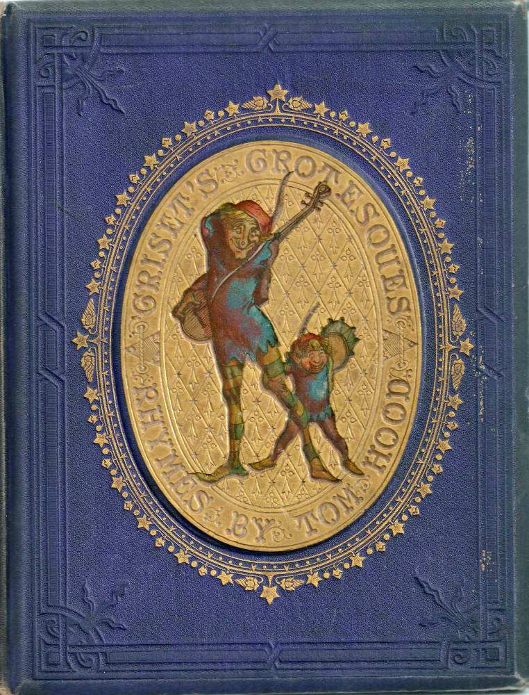
Griset’s Grotesques. Click on image to enlarge it.
Similarly, the decorations for James Greenwood’s The Purgatory of Peter the Cruel (1868) and The Hatchet-Throwers (1867) are transfers taken from the pictorial title-pages. The same is also true of several books by Hablot Browne. In the case of the binding for Lindon Meadows’s Dame Perkins and Her Grey Mare (1866), the vigorous gilt vignette on the maroon upper board is copied from a colour plate (facing p. 24). Phiz’s immediate contemporaries did the same, particularly Richard Doyle, who issued several books with covers reprinting an illustration. The Story of Jack and the Giants (1851), issued in paper and in red cloth, is a good example (Engen, p.196).
Ball has other doubts when the design is not copied from within but is clearly in the artist’s style. Speaking of the cover for Richard Doyle’s illustrated version of Thomas Hughes’s The Scouring of the White Horse (1859), Ball argues that it is probably not the illustrator’s work but a technician’s, noting how ‘it is open to surmise whether the cover design was supplied by the illustrator or whether the “designer” was a skilled die-cutter interpreting the artist’ (p.66). Once again, this argument is persuasive and it is possible that some cover-designs are the work of die-cutters copying or recreating the illustrator’s work.
Yet, as I have argued elsewhere, Ball’s claims are undermined by his inaccuracies. He notes, for instance, that the binding design for The Scouring is ‘derived from an illustration in the work’ (p.66). But no such illustration appears in its pages, and must, therefore, have been an original work: its resemblance to Doyle’s fantastical fretworks looks too close a fit with his designs for Punch to be an imitation by another hand. Indeed, a close inspection of some of the many bindings for the comic-genre provides clear evidence of the illustrators’ direct involvement. This can be proved not simply by identification of the artists’ signature styles, but also by the fact that in the majority of cases the binding presents images which are singular pieces. Calculated to impress the viewer, they have to be viewed as part of a coherent visual scheme, produced and paid for as part of the artist’s commission. The economic arrangement is impossible to judge because no records survive, but it is probable the illustrator was employed to produce so many images – with one or more earmarked for the front cover and spine.
Cloth bindings by Hablot Knight Browne and Charles Altamont Doyle
Better known as Phiz, Hablot Knight Browne was one of the most famous illustrators of the period from the 1830s to the 1850s; as Charles Dickens’s primary collaborator, he also embellished a series of novels by W.H. Ainsworth and Charles Lever. These authors’ fictions were serialized before they appeared in book-form, and in each case Phiz designed the wrappers of the instalment parts as an original piece, and not as a copy of an internal illustration. These were elaborate examples of prolepsis which identified key aspects of the narrative, commented on the characters, set the tone and highlighted the principal themes, especially in the case of his work for Dickens, which deploys a complex iconography. Their role, as an integral part of Phiz’s visual interpretation of Dickens’s texts, has been examined by generations of critics, and is explored in detail by Philip Allingham.
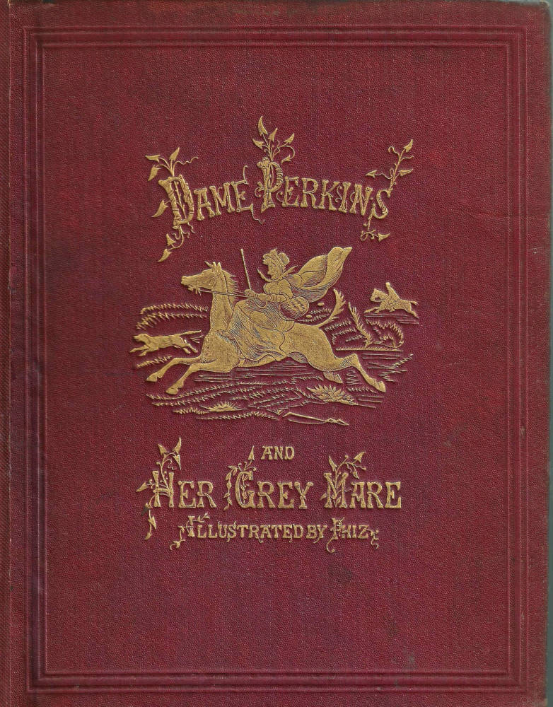
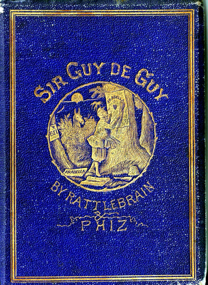
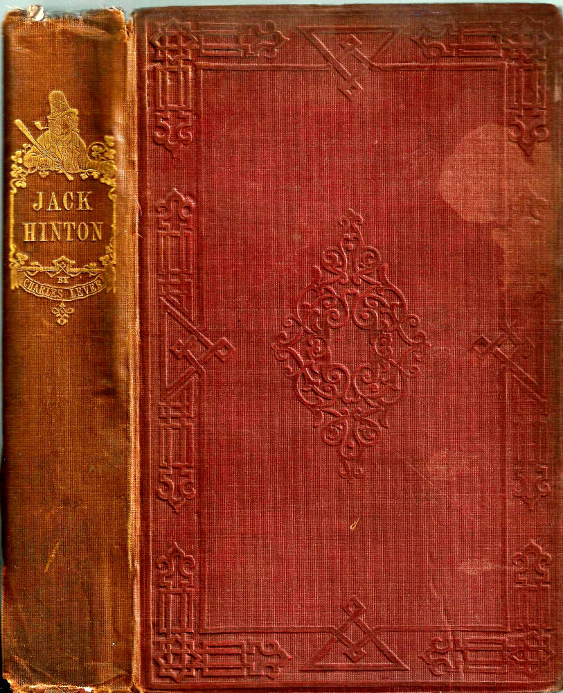
Three bindings by Hablot Knight Browne (Phiz). Left: Linton Meadows‘s Dame Perkins and Her Grey Mare. Middle: Rattlebrain’s Sir Guy de Guy: A Stirring Romaunt. Right: Charles Lever’s Jack Hinton. Click on images to enlarge them.
Less familiar is his work as a designer of bindings in cloth. As noted above, the device for Dame Perkins and Her Grey Mare (1866) is copied directly from an illustration, but others were (probably) original creations, even if identification remains problematic. King ascribes only one ‘original’ binding to Phiz, the front cover for ‘Rattlebrain’s [Richard Halse’s] medieval pastiche of 1864, Sir Guy de Guy: A Stirring Romaunt. Figured as an elaborate roundel containing a representation of a key scene, it is unsigned but can be attributed, as King remarks, on the basis of a ‘similarity’ (p.7) with the artist’s scratchy style. This attribution is I believe an accurate one, yet it is unlikely to be the artist’s only work. A number of other bindings can be ascribed to Phiz, all of them for books containing his illustrations; though unsigned and identified purely on stylistic grounds, they form a small but distinctive group.
Phiz likely designed the distinctive front cover for J. S. Le Fanu’s Ghost Stories and Tales of Mystery (1851). This consists of a gilt scene enclosed within a border of rustic sprigs in a Germanic style; the centre ground is an image of a gravestone embellished with a skull and cross-bones, with an owl placed on top. Though not comical, it has some of the levity associated with Phiz and once again is close enough to his style to be identified as his. A comparison of the details and manner of this composition with the one for Sir Guy suggests it must be by the same hand.
Phiz embellished other bindings for the novels of Charles Lever; a typical example is the comic vignette positioned on the spine of Jack Hinton (1842). He also created designs for the back-strip and front cover for Dickens’s Sketches of Young Couples (1840), which, though printed on paper, is mounted on a fixed board and is best understand in relation to his cloth bindings rather than his images for monthly numbers. Both of these are very much in the comedic style associated with Browne’s humour: the first is an ‘Oirish’ stereotype in the manner of Punch, and the second as piece of surreal slapstick including sets of young couples and diminutive figures of goblins.
All of these bindings contribute to the artist’s effects, and it is unfortunate that so few examples have survived. The fragility of the cloth has condemned most to oblivion; many copies have been rebound with later covers, and the originals still in existence are typically in poor condition. With no documentation and no formal listing of Phiz’s activities as a binding designer, we have to be content with fragmentary evidence. There may be unrecorded examples, while others have entirely disappeared.
The same can be said of designs by Charles Altamont Doyle, the fairy illustrator who probably created several bindings, and certainly made one for ‘Moody Robinson’s’ Coelebs the Younger in Search of a Wife [1859], which he also illustrated. This consists of an elaborate motif of the main character surrounded by rosettes containing his ladies’ faces; placed beneath a rustic title, it is closely linked to the image appearing on the pictorial title-page, which repeats the same idea but replaces the portraits with small figures who reach out to him, their crinolines fusing with the shapes of the roses.
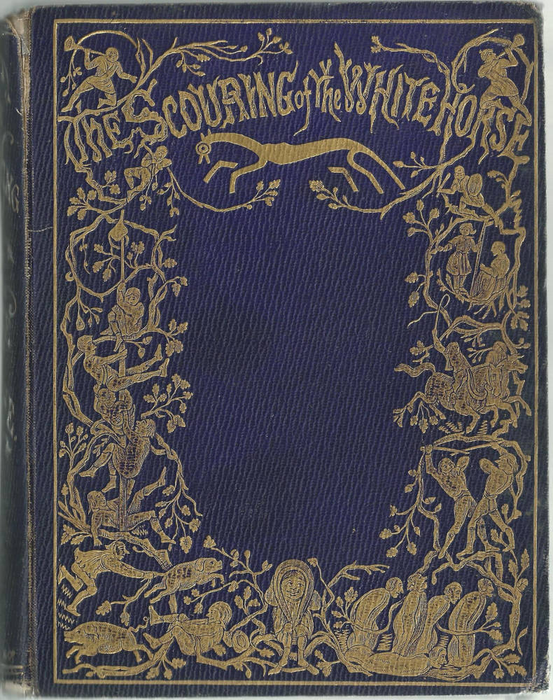
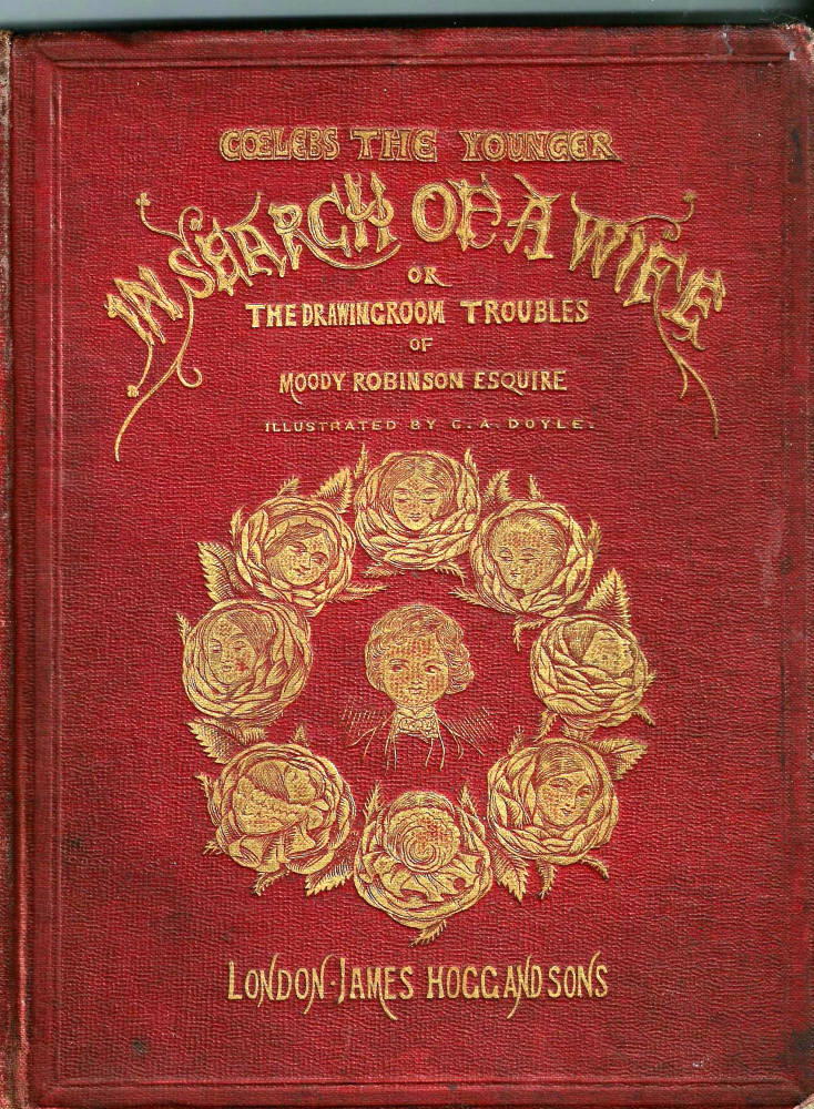
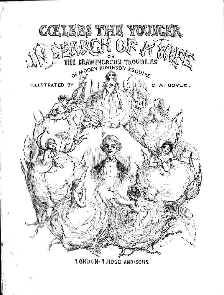
Three designs by Charles Altamont Doyle. Left: The Scouring of the White Horse. Right two: Cover deisgn and title-page for Coelebs the Younger in Search of a Wife. Click on images to enlarge them.
The two compositions are thus linked, but are not the same: rather, the exterior design is a sort of visual preparation for the one inside. The binding design shows the faces of the characters as they emerge, while on the title-page they seem, as it were, to have blossomed. This visual conceit is surely part of a deliberate strategy and forms a direct challenge to Ball’s claim that this type of image was an interpretation of the artist’s work made by the technician who imprinted the die. In the case of this design, it seems to me inconceivable that this image is anything other than an original work, which the artist manipulates as part of a carefully formulated plan to link the outer with the inner.
Such interlinking characterizes the work of both Doyle and Phiz. In both cases, the binding image establishes the tone and character of what is to follow – an effect extending from Phiz’s Irish stereotype on the cover of Lever’s Jack Hilton to Doyle’s mischievous visual joke as his hero’s objects of desire, roses who are literally roses, emerge to take part in the narrative.
Cloth bindings by Charles Bennett, George Cruikshank and John Leech
Leech, Cruikshank and Bennett were the illustrators and binding designers of a large number of works, though only Bennett has been identified as the author of his cloth covers. King lists eight designs (p.5), and as before these are a combination of repeats taken from illustrations and original works.
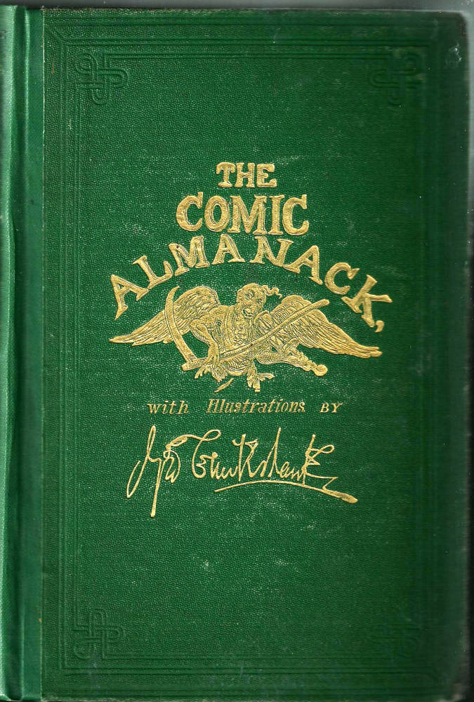
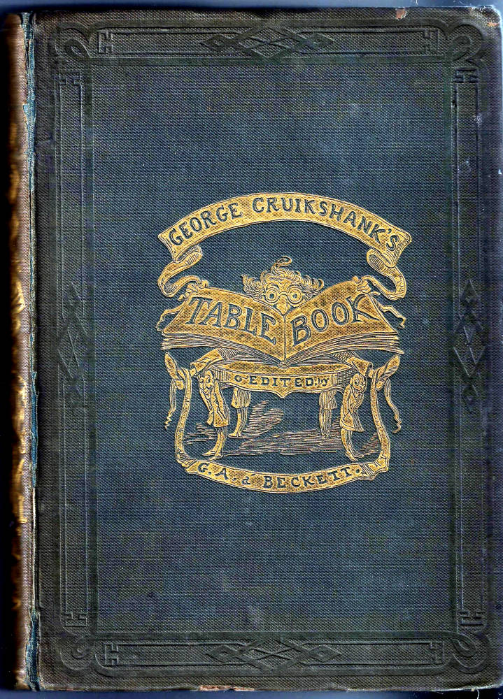
Two bindings by George Cruikshank. Left: George Cruikshank’s Comic Almanack. Right: George Cruikshank’s Table Book,. Click on images to enlarge them.
The notion of re-using illustrations is again a problematic issue. While some of the binding-designs are taken from illustrations, none of them is a straightforward transfer; more typically, they take the form of an edited imagery which might have been derived from Bennett’s illustrations by a technician, but is likelier to be the work of the artist, who selected elements from his graphic images and refigured them for the binding. A characteristic example is The Sorrowful Ending of Noodledoo (1865). This book draws together images from two illustrations and re-arranges them to make a third design, a synthetic approach also used in the bindings for Young Munchausen (1865) and Lightsome, and the Little Golden Lady (1867). Given that Bennett was centrally concerned with the layout and organization of his books, it seems likely that he made these configurations, and was their author. We know of his authorship for certain in the case of two of his books: The Frog who Would a Wooing Go [1858] and The Nine Lives of a Cat (1860) are embellished with original vignettes unmistakeably from Bennett’s hand, and in the case of the second the binding design is signed ‘CHB’.
At the same time, it is likely (as in the case of Phiz), that Bennett designed other bindings which remain unknown because of the ambivalence of the attribution. His practice is principally complicated by the existence of another designer who signed himself ‘CB’. It has been suggested that ‘CHB’ and ‘CB’ could be the marks of Charles Bennett, although Ball and King are unconvinced. Ball makes a firm case for ‘CB’ and ‘CHB’ being unconnected, noting how
The suggestion [that ‘CB’] represent Charles (Henry) Bennett can surely be discounted since his style differed radically and he almost invariably used his middle initial. The initials could represent Charles Bayman, a die-cutter of Paternoster Row (later of Ivy Lane) who was in business during the period [p.93].
However, the situation is not as clear-cut as it might seem and there is strong evidence to suggest ‘CB’ and Bennett could indeed be one and the same. Of the seven books listed by King (pp.1–3), all are juveniles except one, and all are produced during the years 1865–69, when Bennett was at his most prolific and creative. If Bennett were designing bindings for books other than his own, these are the precisely the publications he would chose to work upon – and exactly the type a publisher would match with Bennett’s particular expertise as a comic artist and children’s entertainer. Though Ball says the designs by CB and Bennett are ‘radically’ different (p.93), this is not quite accurate; on the contrary, they are extremely similar.
The possibility of Bennett’s being the elusive ‘CB’ is principally suggested by a binding signed with these initials for Mark Lemon’s Fairy Talesof 1868. This presents on its upper board an amusing gilt device of mother and cub and a disgruntled bear, and is taken from an illustration: but the illustration is by Charles Bennett, who shared the task of visual embellishment with Richard Doyle. It seems to me unlikely that ‘CB’, as a separate individual, would design a binding by taking an illustration from Charles Bennett in a book illustrated by this artist. Surely ‘CB’ and ‘CHB’ are the same? In the absence of documentation we can only surmise on the basis of circumstance and similarity.
No such complications attend the bindings of John Leech and George Cruikshank, both of whom designed gilt embellishments to suggest the contents of their comic publications. A couple of examples will suffice. For George Cruikshank’s Table Book (1845) the artist presents a droll figure, arms and legs akimbo, holding open the book for our perusal, a comic invitation to read on; and in The Comic Almanack (1844–53) he invites us to contemplate humour bound by mortality, as figured in the shape of a comical Father Time, playing a scythe and hourglass as if they were a fiddle and bow. Such humorous conceits feature on the exteriors of many of Cruikshank’s books, the great majority of them being original pieces which link to the illustrations within. So much might also be said of Isaac [Robert] Cruikshank’s comic books, especially his Cruikshank at Home (1845), which is in close imitation of his brother’s style.
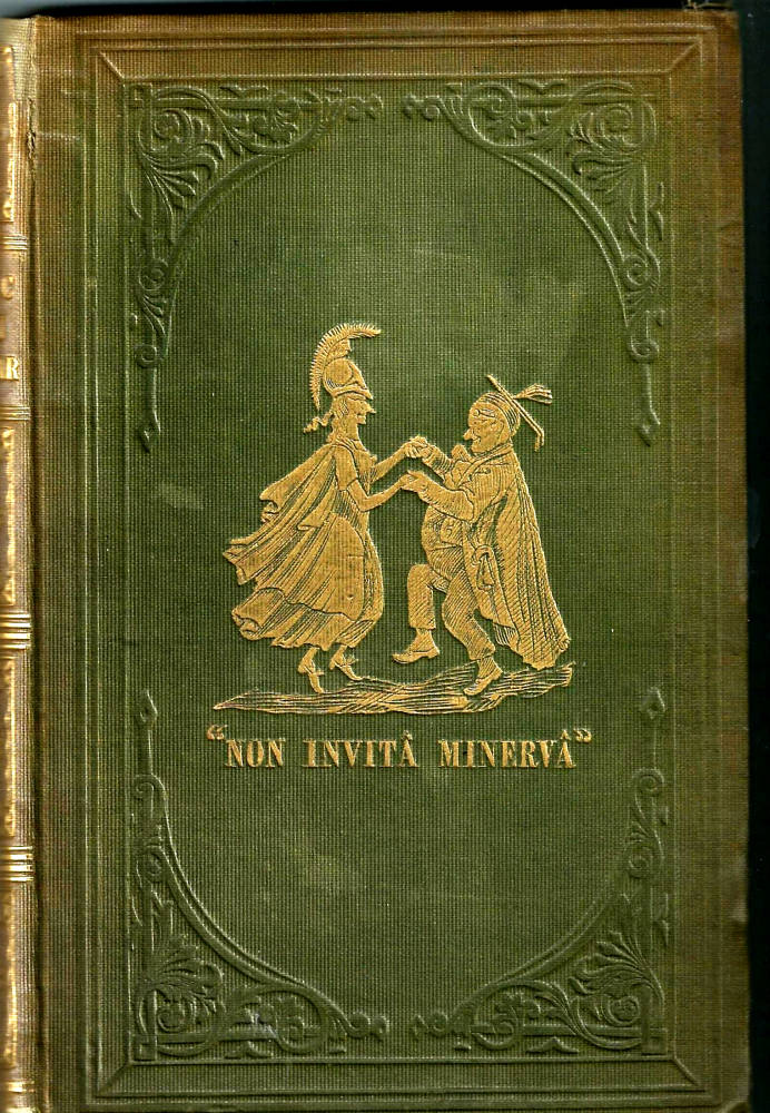
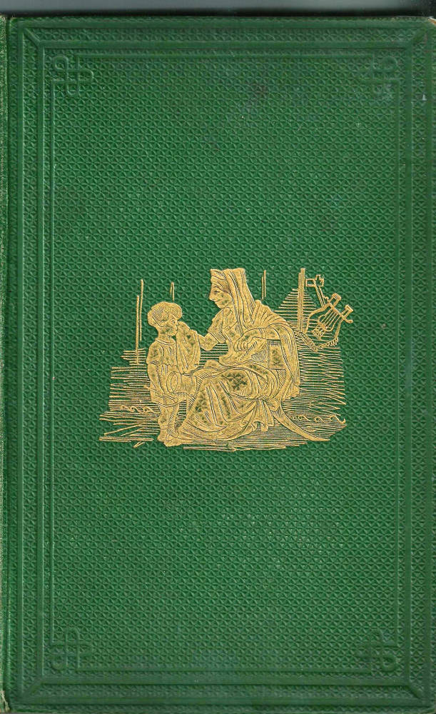
Three bindings by John Leech. Left: The Comic Latin Grammar. Middle: The Comic History of Rome. Right: A Little Tour in Ireland. Click on images to enlarge them.
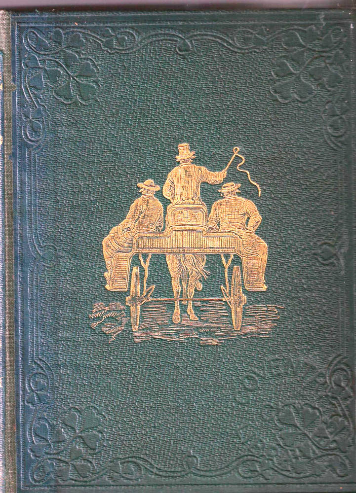
John Leech’s approach to binding is just as inventive. It is exemplified by those for his comedy versions of history. The Comic Latin Grammar (1858) shows a mock-classical goddess dancing a jig with a pot-bellied Dickensian teacher: a vigorous opening, in broad caricature, and a droll preparation for the book’s slapstick humour. The Comic History of Rome [1860] deploys the same tactics, although more measured is the rear view of a cart and passengers which features on the front cover of Dean Hole’s Little Tour of Ireland (1859), inviting us to step aboard and share the journey.
Taken as a whole, then, the comic artists of the middle of the period were inventive binding designers who used imagery in gilt to add to the effects created by their illustrations. Authorship is a key issue – and demands further investigation. But in most cases the artists’ style is unmistakable, an addition to their books’ delightful effects, working in the form of comic designs in front of our eyes and before a page has been turned, to announce the laughter.
Related material
Works Cited
Ball, Douglas. Victorian Publishers’ Bindings. London: The Library Association, 1985.
A Beckett, Gilbert. The Comic History of Rome. Illustrated with hand- coloured illustrations and with unsigned front cover and back-strip designs by John Leech. London: Bradbury & Evans [1860].
Bennett, Charles. The Frog Who Would a Woo-ing Go. Illustrated and with a front cover designed by Bennett. London: Routledge, Warne & Routledge [1860].
Bennett, Charles. Lightsome, and the Little Golden Lady. London: Griffith and Farran, 1867.
Bennett, Charles. The Nine Lives of a Cat: a Tale of Wonder. Illustrated and with a front cover by Bennett. London: Griffith and Farran, 1860.
Bennett, Charles. The Sorrowful Ending of Noodledoo. Illustrated and with a front cover by Bennett. London: Sampson Low, 1865.
Bennett, Charles. The Surprising Unheard and Never to be Surpassed Adventures of Young Munchausen. Illustrated and with a front cover by Bennett. London: Routledge, Warne, & Routledge, 1865.
The Comic Almanack. Illustrated and with unsigned cover and spine designs by George Cruikshank. London: James Hotten, 1853.
The Comic Latin Grammar. Illustrated and with an unsigned front cover by John Leech. London: Bogue, 1858.
Cruikshank at Home. Illustrated and with unsigned designs on the backstrip by Robert Cruikshank. London: George Bohn, 1845.
Dickens, Charles. Sketches of Young Couples. Illustrated and with an unsigned front cover by Phiz. London: Chapman & Hall, 1840.
Engen, Rodney. Richard Doyle. Stroud: The Catalpa Press, 1983.
George Cruikshank’s Table Book. Illustrated and with an unsigned cover design by Cruikshank. London: The Punch Office [Bradbury & Evans], 1845.
Greenwood, James. The Hatchet-Throwers. Illustrated by Griset [and with a front cover repeating his pictorial title-page]. London: John Hotten, 1866.
Greenwood, James. The Purgatory of Peter the Cruel. Illustrated by Griset [and with a front cover repeating his pictorial title-page]. London: Routledge, 1868.
Griset’s Grotesques; or, Jokes Drawn on Wood, with Rhymes by Tom Hood. Illustrated and with a front cover after Griset. London: George Routledge, 1867.
[Halse, Richard]. Sir Guy de Guy: a Stirring Romaunt. Illustrated by Phiz and with an unsigned cover design by Phiz. London: Routledge, Warne, 1864.
Hole, Dean. A Little Tour in Ireland. Hand-coloured illustration and unsigned front cover and back-strip designs by John Leech. London: Bradbury & Evans, 1859.
Hughes, Thomas. The Scouring of the White Horse. Illustrated and with an unsigned front cover by Richard Doyle. London: Macmillan, 1859.
King, Edmund. Victorian Decorated Trade Bindings, 1830–1880. London: The British Library & Newcastle: The Oak Knoll Press, 2003.
Le Fanu, J. S. Ghost Stories and Tales of Mystery. Illustrated by Phiz and with an unsigned binding by Phiz. Dublin: James McGlashan, 1851.
Lemon, Mark. Fairy Tales. Illustrated by Richard Doyle and Charles Bennett; cover design repeats an illustration by Bennett and signed ‘CB’(probably Bennett). London: Bradbury & Evans, 1868.
Lever, Charles. Jack Hinton. Illustrated by Phiz and with an unsigned backstrip design by Phiz. Dublin: Curry, 1842.
Maclean, Ruari. Victorian Book Design and Colour Printing. London: Faber & Faber, 1963.
Meadows, Lindon. Dame Perkins and Her Grey Mare. London: Sampson Low, 1866. Chromolithographs by Vincent Brooks after Phiz, and with an unsigned front cover from a design by Phiz.
Pantazzi, Sybille. ‘Four Designers of English Publishers' Bindings, 1850-1880’. Papers of the Bibliographical Society of America 55 (1961): 88-99.
‘Robinson, Moody’. Coelebs the Younger in Pursuit of a Wife . London: Hogg, n.d. [1859]. Illustrated and with an unsigned binding designed by C. A. Doyle.
Russell, William Howard. The Atlantic Telegraph. London: Day [1866]. 26 chromolithographs and in a signed binding by Robert Dudley.
The Story of Jack and the Giants. Illustrated by Richard Doyle and with a cover repeating a device by Doyle on the pictorial title-page. London: Griffith and Farran, 1851.
Last modified 9 May 2015